For many years, we have been creating granite sinks and washbasins that fit seamlessly into homes and spaces designed with attention to detail. From this experience, a palette of colors was born-one that architects readily use across various concepts: from bright, airy interiors to more atmospheric ones; from minimalist spaces to those with pronounced structure. These are colors that, thanks to their stability and tonal consistency, allow interiors to be designed in a coherent, predictable, and elegant way.
However, the evolution of contemporary interior architecture required more from us than a palette of harmonious shades. What was needed was a color that-in terms of optics, reflections, and tonality-could respond to light in a mature, professional way, just like natural materials do. This is how Volcano Grey came to be.

A color refined to meet design expectations
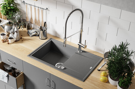
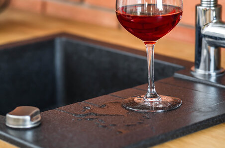
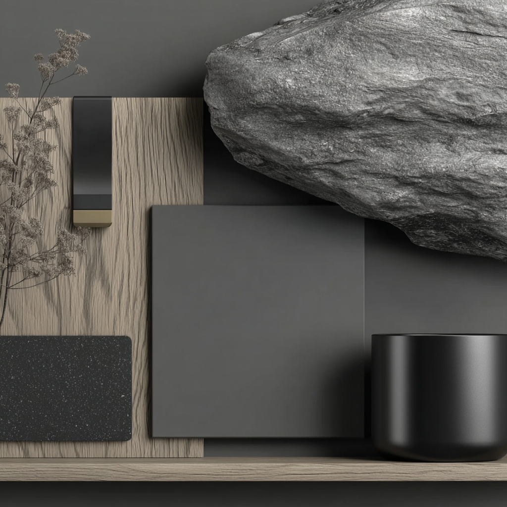
In Volcano Grey, we combined the natural depth of graphite with the softness of grey, creating a shade that maintains a consistent color perception in various lighting conditions. This is essential not only for private kitchens and bathrooms, but also for commercial interiors-showrooms, investment apartments, and architectural concepts-where visual uniformity and batch-to-batch consistency are key.
The new shade was developed using precise pigment-blending technology, ensuring the surface remains uniform while subtly interacting with light. Designers will appreciate that Volcano Grey does not cast unwanted reflections onto adjacent surfaces, making it suitable for compositions with wood, stone, textured plaster, microcement, or satin-finished materials-without the risk of any element becoming visually dominant.
A material that supports the architect’s vision
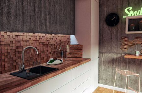
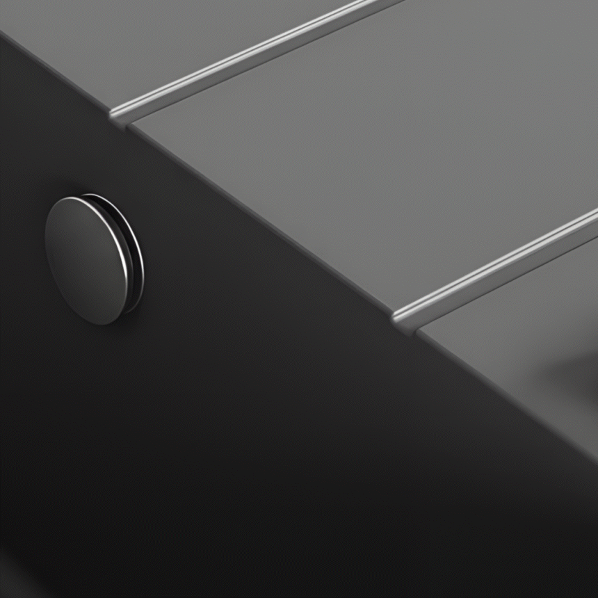
Our granite composites have long been known for their durability, but Volcano Grey has been further enhanced in terms of micro-texture, allowing designers to use it in more demanding environments. Its uniform matte finish does not reflect harsh light, making it ideal for kitchens open to the living area, projects with large glazing, and spaces where light manipulation is a deliberate design tool.
Color stability over time-even under strong daylight-is achieved through the use of UV-resistant pigments. This allows Volcano Grey to be used safely in highly sunlit interiors and premium projects where the color must remain unchanged for many years.
Volcano Grey as a tool for shaping atmosphere
In architectural work, the key lies in details-those that don’t attract attention at first glance, yet create a cohesive whole. Volcano Grey works precisely this way. It not only highlights the form of the product; it gives the space a clear structure. It softens contrasts, calms compositions, and at the same time adds a character that lingers.
In more complex projects, it shifts the visual weight from color to texture, structure, and light. In minimalist interiors, it becomes the foundation that maintains aesthetic balance.
A color that completes the palette
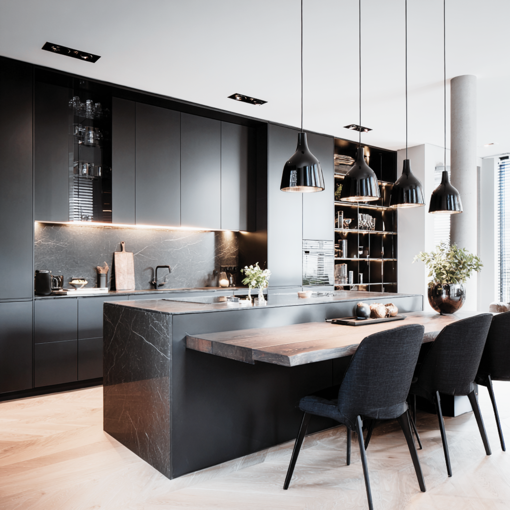
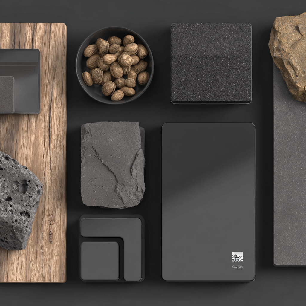
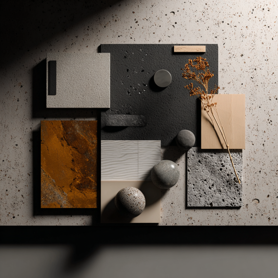
Until now, the shades in our collection addressed many needs: from bright, luminous tones to those more expressive and intense. Each had its own story and purpose. But it was Volcano Grey that made the palette complete. It is a shade that pairs equally well with light lacquered fronts and dark satin cabinetry; with oak countertops and sintered stone slabs with a stone-like texture; with microcement, concrete, glass, and metal.
Architects will appreciate that Volcano Grey does not limit creative possibilities-on the contrary, it expands them, bridging materials for which finding a compatible tone was previously difficult.

VOLCANO GREY
A color that inspires designers.
A color that elevates the space.
A color that was missing.